
How to Create App Store Screenshots That Increase Installs
A practical system for combining benefit-led copy, deliberate sequencing, readable design, and product screens that prove every claim.
Introduction
Effective App Store screenshots do more than show what an app looks like. They explain why someone should care, connect that promise to visible product evidence, and move through a sequence that is easy to understand in seconds.
The strongest sets combine four things: a clear audience problem, benefit-led copy, a deliberate story, and app screens that prove every claim. Design supports that message through hierarchy, contrast, focus, and consistency. It should never make the user work harder to understand the product.
This guide presents the same core framework we use when planning screenshot stories in Lappka: start with the promise, give each card one job, match every line of copy to real UI, and make the complete set feel like one story.
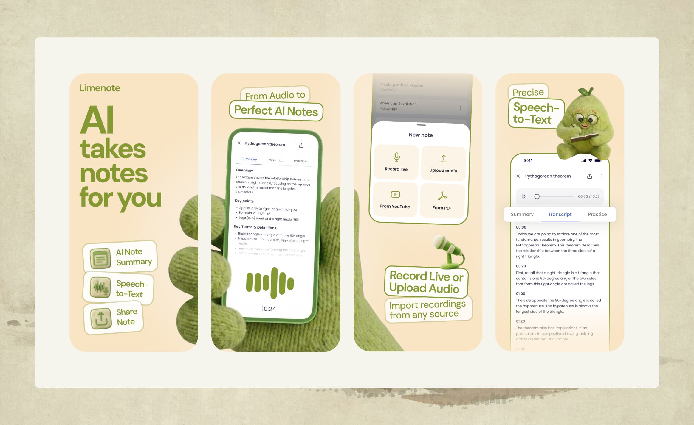
Screenshots Are Mini Ads
The biggest mistake is treating screenshots as documentation. A sequence of home screen, settings screen, profile screen, and dashboard screen may accurately represent the app, but it rarely explains why the app is valuable.
Each screenshot should work like a small ad. It needs a single message, a visible reason to believe that message, and enough visual clarity to be understood at a glance. Together, the cards should answer a progression of questions:
- Is this app relevant to me?
- What problem does it solve?
- How does it solve that problem?
- What outcome can I expect?
- Why should I trust the promise?
This does not mean every card needs aggressive sales language. It means every card should earn its place. A screenshot that shows a beautiful interface but adds no new reason to install is using space without advancing the story.
The first screenshot matters most because it may be the only one a visitor reads. It should communicate the strongest promise without depending on the rest of the sequence. Later screenshots can add depth, demonstrate features, establish trust, and show the final outcome.
Start With a Brief
It is tempting to begin by picking a gradient, device frame, or template. Those choices are easier when the message is already clear. Before designing, write a short project brief with three inputs:
- Category and pitch: What kind of app is this, and what is its simplest useful description?
- Target audience and main pain: Who is it for, and what frustrating situation are they trying to change?
- Prioritized value propositions: What are the most important outcomes the app creates, in order?
Category and pitch: A private notes app that keeps ideas organized across devices.
Audience and pain: Busy professionals who capture ideas in several places and struggle to find them later.
Value propositions: Capture ideas quickly, find any note fast, access notes anywhere, and keep private information protected.
This brief provides a filter for every later decision. If the audience pain is scattered information, the opening should not lead with theme customization. If the main promise is instant retrieval, a search result screen may be stronger evidence than the home screen.
A brief also limits unsupported claims. It tells the writer what the product can promise and gives the designer a reason for choosing one screen over another. When no brief exists, infer a starting point from the product UI, but treat it as a hypothesis to confirm rather than a fact.
Audit Screens by What They Can Prove
Not every product screen is equally useful for marketing. Before writing headlines, review the available screens and classify each one:
- Strong: The value is visible without a long explanation. The screen contains a clear action, state, result, or transformation.
- Supporting: The screen reinforces a promise but needs a headline or neighboring card to make its value obvious.
- Weak: The screen is generic, crowded, repetitive, or disconnected from a priority benefit.
The goal is not to select the most visually complex screen. It is to select the screen that provides the clearest evidence for a message. A simple search result showing the correct item may be stronger than a polished dashboard filled with small charts.
This screen proves that the user can ________.
If the sentence is vague, the screen probably needs a tighter crop, a clearer state, or a different role. If several screens prove the same thing, keep the strongest one and use the remaining slots for other benefits.
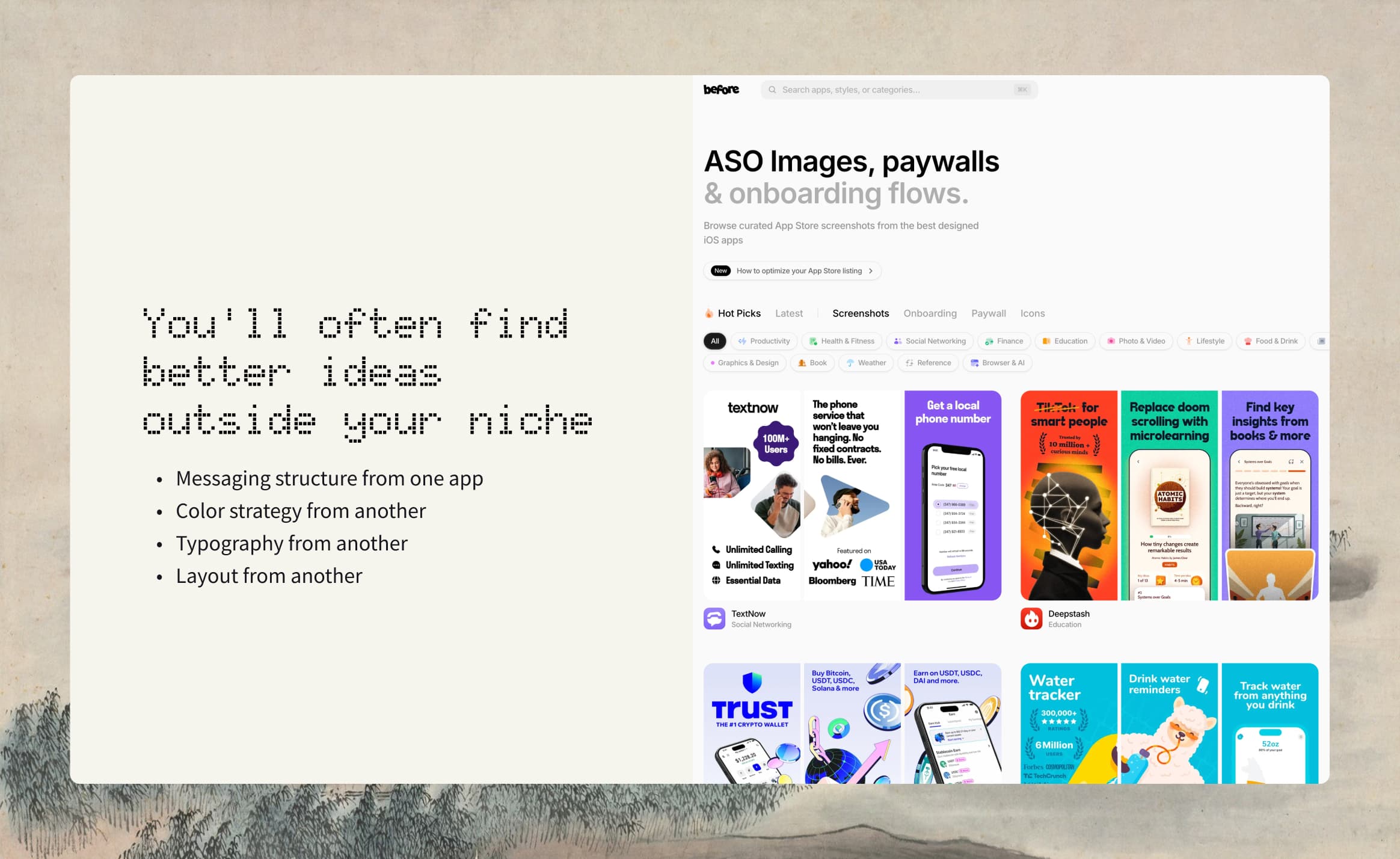
Competitor research can reveal category conventions. Review how other products frame the pain, which colors dominate the category, what users praise in reviews, and where every listing starts to look the same. The goal is to understand the visual language users recognize, then find a clear way to differentiate your message.
Look outside your category too. You can borrow a storytelling structure, typography treatment, color relationship, or layout principle from another niche without copying its content. Keep the product claim and UI evidence specific to your app.
Build a Story Before Writing Individual Screenshots
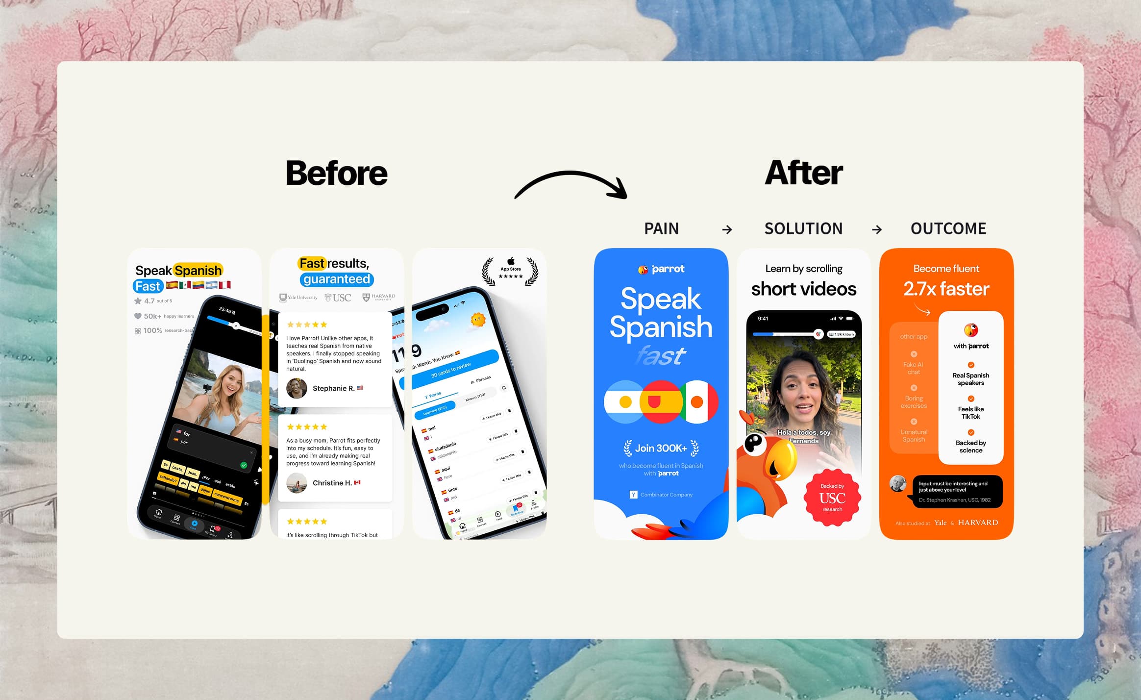
A reliable screenshot story can follow this structure:
- Opening promise: State the strongest benefit or name the central pain.
- Solution: Show how the app changes that situation.
- Key benefits: Demonstrate the few capabilities that matter most.
- Proof: Support the promise with visible product evidence or legitimate trust signals.
- Outcome or closing: End with the transformation or a persuasive next step.
This is a framework, not a fixed formula. A familiar utility may begin with an outcome. A new category may need to explain the problem first. A product with powerful visual proof may lead with the result and reveal the workflow afterward.
| Position | Role | Example headline | Visible proof |
|---|---|---|---|
| 1 | Opening promise | Find Every Idea Fast | Search results with the right note surfaced |
| 2 | Pain and solution | Capture It Before It Is Gone | Quick-add interface with minimal steps |
| 3 | Feature benefit | Stay Organized Automatically | Tags or smart collections populated in the UI |
| 4 | Trust or depth | Your Notes Stay Private | A real privacy or lock control shown in the app |
| 5 | Outcome | Your Ideas, Always Ready | A focused overview that brings the workflow together |
Give Every Screenshot One Message
Each screenshot should sell one benefit. When a card tries to communicate sync, privacy, collaboration, customization, and speed at once, none of those messages receives enough emphasis.
One message per card creates a useful constraint:
- The headline can stay short.
- The relevant UI can be large.
- The layout has a clear focal point.
- The next card can introduce a genuinely new reason to care.
Avoid comma lists and repeated uses of “and.” If the copy needs several clauses to explain the card, split the idea or choose a narrower benefit.
The same rule applies across the sequence. “Organize Your Notes,” “Keep Notes Organized,” and “Better Note Organization” occupy three cards but communicate one idea. Use the extra space to show a different stage of the user journey.
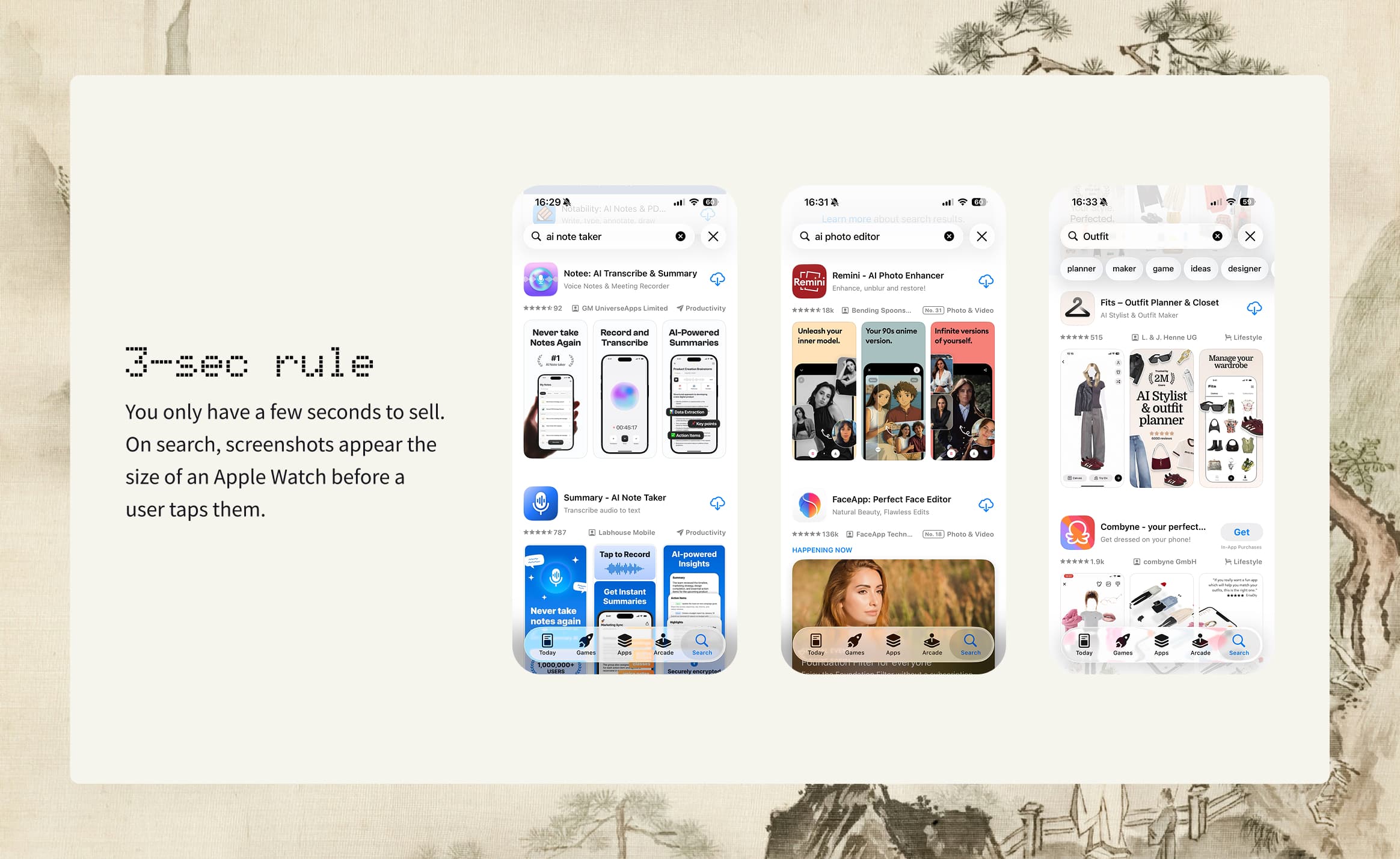
Write Copy for a Three-Second Scan
App Store copy has to survive a quick scan. A headline should usually fit within two to six words and remain understandable when the screenshot is viewed small. Short copy is not automatically good copy, but it forces you to choose the essential idea.
- Lead with a benefit, pain, or outcome.
- Prefer plain language and strong verbs.
- Remove internal product terminology.
- Avoid labels such as “Home,” “Feature 1,” or “Dashboard.”
- Avoid cultural references that may not translate.
- Read the headline without the UI and ask whether it still communicates value.
- View the UI without the headline and ask whether it can support the claim.
| Feature label | Benefit-led version |
|---|---|
| Cloud Sync | Access Notes on Any Device |
| Smart Search | Find Every Idea Fast |
| Custom Reminders | Remember What Matters |
| Weekly Reports | See Your Progress Clearly |
Copy guardrails
Feature labels are useful inside a product. Marketing copy needs to explain what the feature enables.
Avoid unsupported superlatives and proof. Do not invent awards, rankings, testimonials, user counts, or quantified outcomes. Do not claim that a workflow is effortless, instant, or guaranteed unless the product experience can support that wording.
Also avoid overlay text that creates review or trust problems. Price claims, “Free,” “Download now,” fake system notifications, unsupported platform availability, and simulated alerts can distract from the product and quickly become inaccurate.
Use Subtitles Only When They Add Meaning
A subtitle is useful when it explains how the benefit works, adds a necessary qualifier, or provides context that the headline and UI cannot carry alone. It should not repeat the headline in longer language.
Headline: Find Every Idea Fast
Weak subtitle: Find your ideas quickly and easily
Stronger subtitle: Search across notes, tags, and attachments
The stronger subtitle adds information. The weak subtitle repeats the promise. If a title and screen are already clear, omit the subtitle. More copy is not automatically more persuasive.
When a subtitle is needed, keep it to one natural phrase. Make sure it describes the current screen rather than the product in general. Across the gallery, use subtitles consistently enough that the set feels intentional.
Match Every Claim to Visible UI
The title and app screen should form one understandable unit. If the headline promises quick meal planning, the visible UI should show a planning action or completed plan. A generic profile screen cannot prove that claim, even if the feature exists elsewhere in the app.
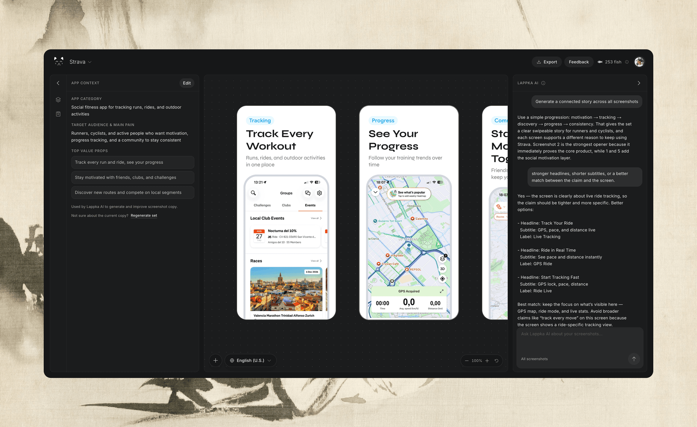
In Lappka, this matching step becomes part of the story workflow. Lappka AI uses your app context and real product screens to plan the screenshot order and draft benefit-led headlines and subtitles. You still choose the final message and screen for every screenshot.
This principle protects both clarity and trust. It also gives design a clear direction. Once you know the exact UI moment that proves the benefit, crop, magnify, or position it so the user sees that moment first.
Write down a proof point beside every headline. If a claim has no screen, choose a different screenshot, a different claim, or a product state that makes the evidence visible. Do not use decorative mockups to disguise the absence of proof.
Design for Search Size, Not Only Full Size
A screenshot can look impressive on a large design canvas and fail when reduced to its real browsing context. Zoom out during design reviews. The headline, primary UI moment, and visual hierarchy should remain understandable without close inspection.
View the full set at roughly one fifth of the working canvas. This is a design test, not a performance statistic. Ask:
- Can I read the headline?
- Can I identify the focal UI moment?
- Does one element lead the eye?
- Can I distinguish the cards from one another?
- Does the sequence still feel connected?
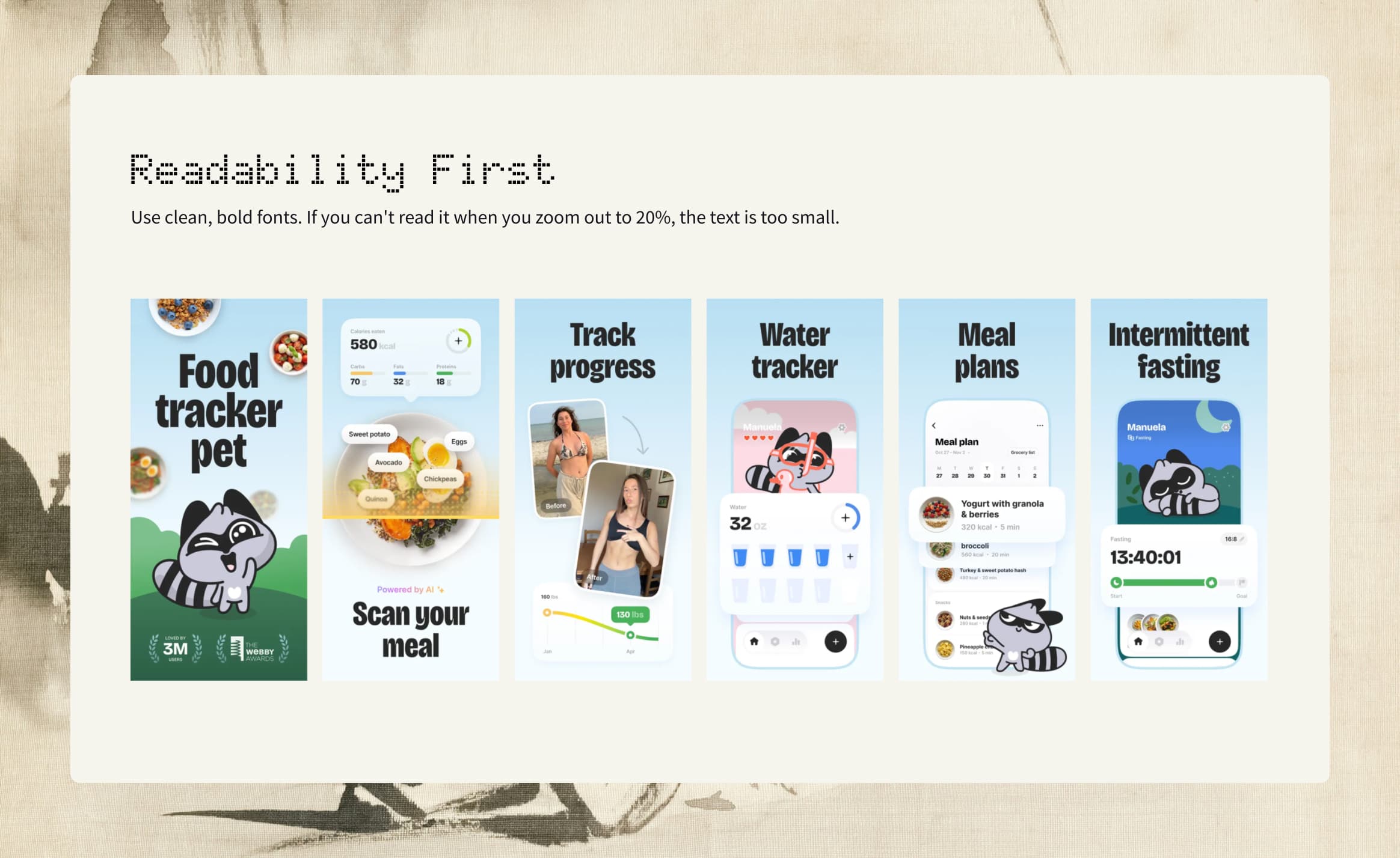
Use bold, clean, high-contrast typography. Keep important text and UI away from the edges. Avoid long headlines that need small type. If the interface is dense, emphasize the relevant section rather than presenting the whole dashboard at an unreadable scale.
Let the Product Occupy the Frame
The app is the evidence, so it should not become a small decoration inside a large poster. As a practical starting point, let the visible UI take more space than the surrounding marketing treatment. More than half the card for UI often keeps the product central.
This is not a rigid grid. A bold opening card may use more typography. A detailed product moment may devote nearly the entire card to the interface. The important question is whether the design makes the promised value easier to see.
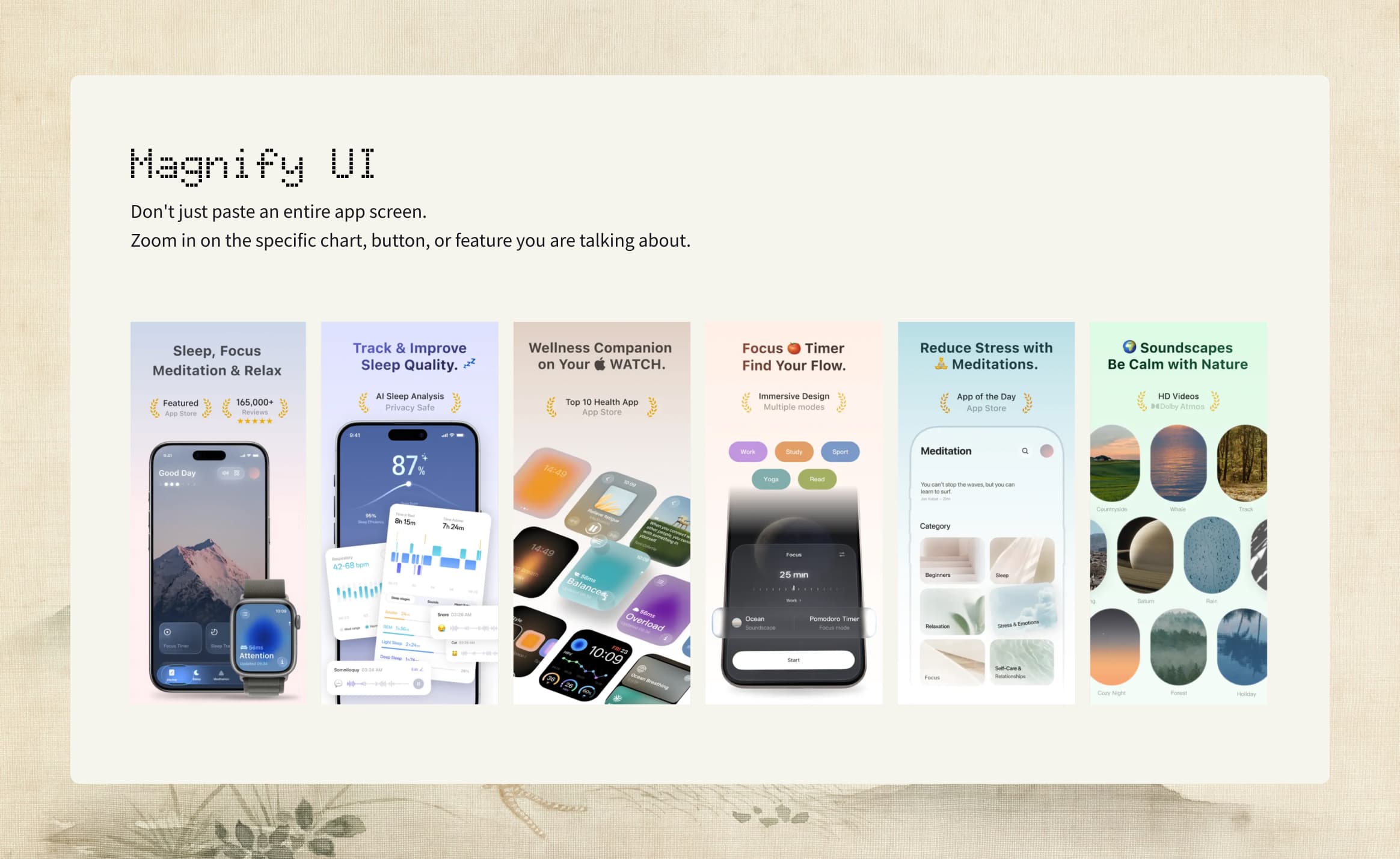
Use device frames with purpose. They can provide context and polish, but they also consume space. Keep device treatment consistent unless a deliberate story moment requires a change. Avoid mixing unrealistic devices, old hardware silhouettes, inconsistent bezels, and unrelated viewing angles within one set.
Use Templates as a System, Not a Substitute for Strategy
Templates speed up production by establishing typography, spacing, device treatment, background language, and recurring layout patterns. They work best after the story and copy are clear.
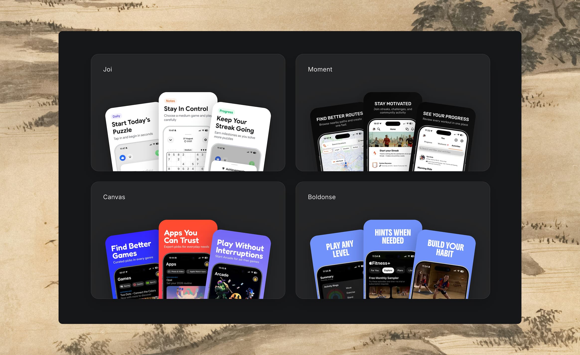
A strong template system keeps the following elements coherent:
- Type family, weight, scale, and alignment
- Color palette and contrast
- Device frame style and angle
- Spacing and safe margins
- Background treatment
- Relationship between title, subtitle, and app UI
Consistency does not mean every card must be identical. The opening can be more expressive, a proof card can prioritize evidence, and a feature card can zoom deeper into the interface. The set should feel related even when the compositions vary.
When working from a reference, borrow its structure rather than its product. Use the reference for composition, typography, lighting, or device treatment. Keep the app UI authentic and do not blend another product interface into the result.
Explore current layouts on the App Store screenshot templates page, then adapt the structure to your own brief and proof points.
Avoid the Most Common Screenshot Mistakes
- Tiny or long text: The headline works on the design canvas but disappears in search.
- Different fonts on every card: The sequence feels assembled rather than designed.
- Unrealistic or inconsistent devices: Hardware styles compete with the app.
- Too much noise: Decorative elements, gradients, icons, copy, and UI all demand attention.
- Inconsistent backgrounds: Cards do not read as one product story.
- Poor contrast: The copy blends into the background or device.
- Generic feature labels: The set describes navigation rather than value.
- Repeated messages: Several cards make the same promise.
- Unsupported claims: Copy promises something the visible product cannot prove.
- Decorative screenshots: A card looks polished but contributes no new reason to install.
The solution is usually subtraction. Remove a secondary message, enlarge the relevant UI, simplify the background, strengthen contrast, or replace a weak screen. A cleaner design cannot rescue an unclear promise, so fix the message first.
Localize the Message, Not Just the Words
Localization is more than replacing English copy with a literal translation. Headlines expand or contract, idioms lose meaning, and the benefit that resonates in one market may need a different emphasis in another.
Start with English as the source of truth, then preserve the intended meaning in each target language. Use natural, persuasive phrasing. Never add capabilities or claims during translation. Review the localized screenshot at its actual display size because a correct translation can still break the layout.
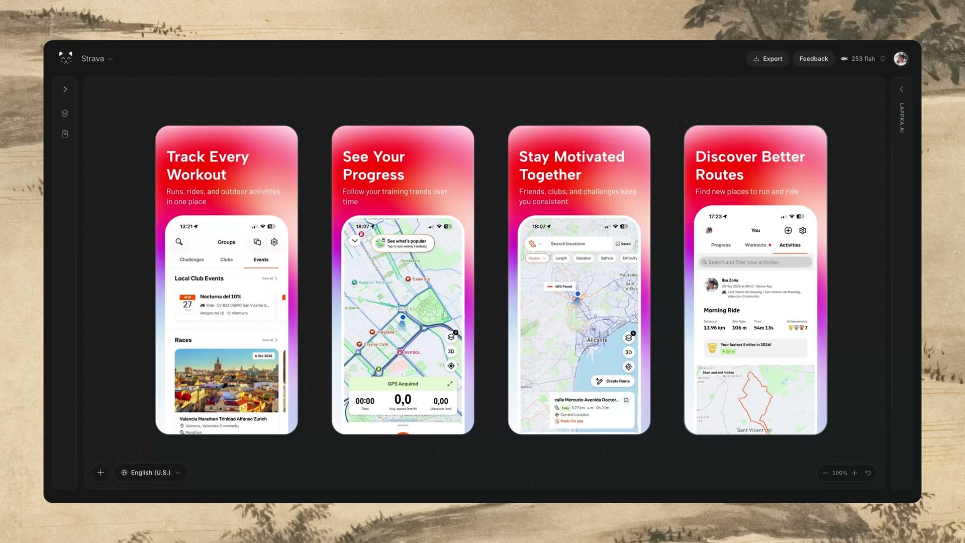
Keep the visual system stable where possible, but allow type size, line breaks, and spacing to adapt. The goal is equal clarity, not identical geometry. See the App Store screenshot localization workflow for a repeatable approach.
A Practical Workflow From Raw Screens to a Finished Set
Define the strategy
Write the category pitch, audience pain, and prioritized value propositions. Choose one dominant promise for the set.
Collect real product screens
Capture clean, realistic states. Remove placeholder content and make sure private information is not visible.
Audit the evidence
Classify screens as strong, supporting, or weak. Write one proof sentence for each and remove duplicates.
Plan the sequence
Assign an opening promise, solution, benefits, proof, and outcome or closing role. Adapt the order when the product needs a different explanation.
Draft the copy
Write benefit-led headlines of roughly two to six words. Add subtitles only when they provide useful context. Check every claim against the brief and visible UI.
Compose the cards
Make the title and relevant UI instantly understandable together. Magnify important details, preserve safe margins, and keep the product central.
Apply a consistent system
Align typography, colors, spacing, backgrounds, and device treatment. Let each role vary within that system.
Test at reduced size
Review the set as a user will encounter it. Confirm that the first card works alone and the complete sequence remains readable.
Localize and review
Adapt meaning for each locale, review line lengths, and verify that no claims changed in translation.
Export to the correct specifications
Check the latest required dimensions and file rules before upload.
Use the App Store screenshot sizes guide for the technical export step.
You can also use Lappka to turn uploaded app screens into an editable story, refine the copy and sequence, apply a template, localize the set, and export the result.
Final App Store Screenshot Checklist
Before publishing, review the set from message to export:
Strategy
- The audience and main pain are clearly defined.
- The set has one dominant promise.
- The chosen benefits reflect actual product capabilities.
- Every card has a distinct role in the sequence.
Copy
- Each card communicates one idea.
- Headlines are short, benefit-led, and understandable in a quick scan.
- Feature labels have been translated into user outcomes.
- Subtitles add information instead of repeating headlines.
- Headlines do not repeat across the gallery.
- There are no invented rankings, testimonials, statistics, or capabilities.
- Spelling, capitalization, and punctuation are consistent.
Product proof
- Every claim matches the visible app screen.
- The most relevant UI moment is easy to identify.
- App content is realistic and free of placeholder text.
- Weak or repetitive screens have been replaced or given a clear supporting role.
Visual design
- The first screenshot works without a swipe.
- Headlines remain readable at reduced size.
- Text and important UI stay inside safe margins.
- The product UI is large enough to understand.
- Contrast is strong across every card.
- Typography, backgrounds, and device treatment feel consistent.
- Decorative elements support the message rather than compete with it.
Localization and export
- Each translation sounds natural in its target language.
- Localized copy preserves the original meaning and claims.
- Line breaks and type sizes have been reviewed per locale.
- Dimensions and file formats match current App Store requirements.
- The full set has been previewed in its expected browsing context.
Turn Your Screens Into a Story
Great App Store screenshots begin with a clear argument: this product understands a real problem, offers a useful solution, and can prove it through the interface. Copy creates the message. Sequence creates momentum. Design makes both easy to grasp.
Start with the strongest promise, give each card one job, and remove anything that does not help the user understand the value. The result will be more than a polished gallery. It will be a coherent reason to explore the app.
Screenshot size guide
Check current iPhone dimensions, formats, and export requirements before you upload.
Read the guide ExploreScreenshot templates
Start with an editable design that can carry one visual system across the complete story.
View templates LocalizeScreenshot localization
Adapt the message and visible product screens for every market without rebuilding the design.
Explore localization